Tuesday, 27 November 2012

Organisation of Actors, Props and Costumes

My main character in my film is a sixteen year old girl called Anna.
About Anna;
  • Naive
  • Easily lead on by her friends
  • Shy
  • Loyal
  • Wants to fit in with her friends and would do anything to do so.
To show Anna's innocent and shy side, in the teaser trailer, Anna will be wearing a non-revealing flowery dress similar to this one;

Anna's style will be very plain and simple to help show her personality.
 
A prop that Anna will have is sixteenth birthday cards to show that her age is an important part to the narrative of the film.


---------------------------------------------------------------------------------

Another actor in my film is another sixteen year old girl called Anya.
About Anya;
  • Leader, likes to be in control
  • Selfish
  • Likes to play practical jokes
  • Rebellious
To show Anya's rebellious side, in the teaser trailer, Anya will be wearing an outfit similar to this;
 
Anya's style will be more fashionable than Anna's to show her outgoing personality.
 
A prop that Anya will have which is an important part of the teaser trailer is the research that she finds. This is an important prop as it shows the recognition of the problem. The research that Anya had found was from a well known website so it will make the story more realistic.


Questionnaire and Results

This is the questionnaire that I sent out to help me create my film. I gave my questionnaire to 50 students and teachers at my college to get a different range of results. As I am going to create a horror film, I will based my questionnaire on horror films.


1. What gender are you?

Male/Female


2.      What is your age range?

15-17

18-21

22-30

30+


3.      Do you like watching horror films?

Yes/No


4.      What gets you interested in a horror film?

Trailer

Poster

Film Website


Film Magazine

Other people think the film is good


5.      Does the film trailer help you decide whether to watch the film?

Yes/No


6.      How long should a teaser trailer be?

20-30 seconds

30-40 seconds

40-50 seconds

50 seconds to a minute


7.      Do the actors in the film encourage you to watch it?

Yes/No


8.      Which two of the following,  encourages you the most to watch a film when watching the trailer?

Actors/Actresses

Soundtrack

Setting

Narrative


After I had collected back all of the questionnaires that I had sent out, I made a few pie charts of the results so they would be clear and easy to analyse.


This pie chart is referring to the question; What gets you interested in a horror film?
As you can see from the pie chart, a majority of the people who answered the questionnaire thought that the trailer would get them interested in a film. Nobody thought that a film website would get them interested in a film, therefore I will not include a film website on the poster or trailer.


This pie chart refers to the question; Which two of the following, encourages you the most to watch a film when watching the trailer? This pie chart shows that half the people who answered the questionnaire, thought that the narrative in the trailer would encourage them. From this, I have decided to give my teaser trailer a strong narrative without giving too much away. Also, just over a quarter of the people I asked thought that the setting in the trailer would encourage them. In my teaser trailer, I will include a setting which is a typical horror film convention, but still an effective one like the woods to make my teaser trailer effective. Not many of the people I asked thought that the actors/actresses would encourage them to watch a film as they thought horror films seem more realistic with a less know actor/actress starring in them.


This pie chart refers to the question; How long should a teaser trailer be? As you can see from the results, most of the people I asked, thought a teaser trailer should be about 40-50 seconds. I assume this is because a teaser trailer shouldn't give too much away so it gets an audience interested.
 
 
This pie chart refers to the question; Do the actors in the film encourage you to watch it? As you can see from the results, the pie chart shows that most people thought the actors in a film does encourage them to watch a film. As I only have a very limited budget, I would not be able to afford a big actor/actress to star in my film, therefore, I will include actors/actresses that the audience can identify with, for example, someone who is the same age as my target audience. 


Paranormal Activity Magazine Cover Analysis

 
This is the magazine cover Entertainment featuring the film Paranormal Activity. From looking at this magazine cover, my first impressions of this film is that it would be a comedy rather than a horror. Unlike the film poster of this film having a picture from the actual movie, the magazine cover has an alternative picture on it. This makes the magazine less effective as it doesn't relate to the film poster or teaser trailer for the film.
 
The masthead of this magazine is Entertainment, I don't think this is a very effective name for a horror magazine because it gives me the impression that the films that are included in the magazine, would be drama or comedy films, not a horror. On the cover, there is big pink stars dotted around, this isn't very effective as it has no relevance to the featured film.
 
The title of the film, Paranormal Activity, stands out well against the main image. However, unlike other film magazines that I have analysed, the font that is used on the film poster, isn't included on the magazine cover which gives it no relation to the film poster. When creating my magazine cover, film poster and teaser trailer, I will make sure that all three will relate to each other and will tell the genre of the film.
 
On the left of the magazine cover, there is a sell line that says; 'How a tiny $11,000 movie became a big scary smash' this is telling you the facts about the featured film to get an audience interested in reading the magazine. On my magazine, I will possibly include this.

Insidious Magazine Cover Analysis

 
This is a horror film magazine called Fangoria featuring the film Insidious. The masthead of the magazine instantly gives away the genre of the films featured in the magazine. This is very effective as audience will instantly know what magazine to get if they're looking for a horror film. The font of the masthead is also very effective because of the sharp points on the lettering gives it a dangerous look. Also, because the outline of the masthead is red, it looks as if blood is dripping from it which makes it look creepy and scary.
 
The main image of the magazine cover is a scary character from the film Insidious. This gives an insight to the horror's that are included in the film which will draw attention. The title of the film is included on the magazine cover so the audience will know which film it is featuring. Also, the magazine has used the same font that was used on the film poster and teaser trailer so that they will all relate to each other.
 
At the bottom of the magazine cover, there is a strip of other horror films. This tells the audience that this magazine only features horror films so that it's main target audience is people who like horror films. When creating my magazine cover, I will make sure that it is clear that it will only feature horror films so that it has a specific target audience.
 
The sell lines around the main image of the magazine have nothing to do with the featuring film, when creating my magazine cover, I am going to include sell lines that are related to the featured film.
 
At the top of the magazine cover above the masthead, it says 'Italian Horror! American Terror! German Gore!' this shows that this magazine is a worldwide magazine and atttacts a wide audience.

Chernobyl Diaries Film Poster Analysis


Chernobyl Diaries is a horror film related to the aftermath of the nuclear explosion in Chernobyl. Chernobyl Diaries is a 2012 film which was co-produced and directed by Bradley Parker and Oren Peli. Chernobyl Diaries was made by the makers of Paranormal Activity and Insidious. Referring to this on the poster draws an audience in as they already know it will be a good film as it is made by the people who have already produced two good selling films.

From looking at the poster without reading any of it, audiences will already know that the film has a dark side to it and most likely be a horror film. The audience will know this because of the colours in the poster, black, white and red. This common housestyle is used a lot in horror posters because of the connotations of the colours. The colour red represents danger and the colour black represents darkness. Also, having red and white text upon a black background makes it stand out and easy to read.

As like most film posters, this poster gives a hint to the setting. The setting looks like it is a run down town. This adds to the horror of the film and would make people want to see it because audiences will want to know why is it run down? What happened to it? This relates to Barthe's theory as the audience will want to know the answers to the film and therefore watch it. Also, in the clouds of the main image, there is a nuclear sign. This will attract an audience as people know that nuclear is powerful and dangerous and will want to know what's happened.

There is a billing block at the bottom of the poster. A billing block is a condensed block of writing that contains, companies, directors and other cast members and crew. This will attract the target audience as they may realise their favourite actor or director starred or directed the film. This will encourage them to watch the film as they are interested in their work.

There is a tagline above the title which says; 'Ten years ago, the Ukranian government let tourists visit the area around Chernobyl. They said it was safe...It wasn't' this tagline gets an audience interested as they get an insight to the narrative of the film. This attracts an audience as they already know what part of the film is about, and will want to know the ending of the film. Also, the audience will want to know 'Why wasn't it safe?'


Insidious Film Poster Analysis


Insidious was made by the makers of Paranormal Activity and Saw. Referring to this on the poster draws an audience in as they already know it will be a good film as it is made by the people who have already produced two good selling films.
The title of the film stands out clearly as it is mostly in a strong white colour against a dark background. The style of the title is also unique as part of the title is red. The connotations of red are danger and blood. This suggests to the audience that the film has a dangerous dark side to it. The word Insidious means 'Intended to entrap' which gives a clue to what the film is about.

The main image on this poster is a sinister looking boy in front of an old big house. The big old house in the background is a typical convention of a horror film.  The sinister looking boy goes against the average codes and conventions of a young boy as young boys are perceived as being ‘good’. This could relate to Claude’s theory of binary oppositions as the boy is opposite to normal boys. This could draw an audience to the film as the audience want to know why he’s different.

The main image has a short depth of field as the boy is in focus and the house is out of focus. This gives a subtle hint to what the film is about. The main focus of the poster is the boy and not the house, which is unusual for a horror film as most of them take place in a big old house. This will draw in a bigger audience as they will believe it is different to other horror films they have seen.
Most of the main images colours are all drained. This gives the film poster a dark and eerie feeling. The boy’s pyjamas are red which suggests danger towards the boy. Also, because the image is of the boy in his pyjamas, the audience may think, ‘why he is in his pyjamas, is there something wrong with him?’ this gets the audience thinking and encourages them to watch the film as they want to find out why. Having a dull main image makes the title of the film stand out. 

Also, inside the boys eye, the word insidious is written there. This could suggest to the audience that something supernatural is wrong with the boy. I think this will draw an audience as I find films with supernatural children is are scary as it is opposite to what they are perceived to be. 
The tagline ‘It’s not the house that’s haunted’, is a quote from the film and the teaser trailer. This tagline encourages people to see the film as they want to know what haunted if the house isn’t. This relates to Barthes Enigma theory as the audience want to solve the mystery of the film and therefore will watch it.
Having the actors and actresses names on the film poster also attracts an audience. This attracts an audience because if someone is a big fan of Patrick Wilson, then they may decide to watch this film as he is one of the main actors in Insidious.

There is a billing block at the bottom of the poster. A billing block is a condensed block of writing that contains, companies, directors and other cast members and crew. This will attract the target audience as they may realise their favourite actor or director starred or directed the film. This will encourage them to watch the film as they are interested in their work. 

There are also the film institutions at the bottom of the poster. These are the company's logos that created Insidious. These help identify what genre the film is as most film companies stick to a certain genre, for example, Working Title productions tend to make romantic comedies.


Paranormal Activity Film Poster Analysis


Paranormal Activty is based on a true story. The main image of the poster establishes that the film takes place in a house and is filmed by a home camera. This will attract an audience because the paranormal activity happening in the house will seem more realistic as it is filmed with an ordinary camera where there can be no major editing involved. In the image itself, you can see the woman pointing to something that the audience can not see. This relates to Barthe's theory as the audience will want to know What is she pointing at? and therefore will watch the film to find out.

The title of the film stands out really well as text is in red upon a black background. The colours red and black are very popular when making horror film posters because of the connotations of the two colours. This is what identifes this film poster as being a horror.

Out of the other two film posters that I have analysed, this poster has a web address on it to support the film. This is to widen the fan base and to get more people interested in watching the film. Also, this film poster doesn't have a billing block on it showing who's in the film or who produced it. This suggests to me that the makers of the poster have done this on purpose. I think this has been done to make the film more realistic, because if the film starred a major actor, it wouldn't seem as realistic because it is based on a true story. Also, because the film is suppose to be like a home video, it was unneccassary to include the producers or directors name on it.

Treatment

The name of my film is called Hemlock. I have chosen this name as my film is related to the hemlock stone. My film is about a sixteen year old girl called Anna who wants to fit in with the rest of her friends. Anna has just turned sixteen. Anna's friend Anya, tells Anna about a girl 100 years ago who just turned sixteen. The story that is told is about a girl who just after her sixteenth birthday, visited the ancient Hemlock stone out of peer pressure. No one knows what happened to her after that day. Anna doesn't believe Anya's story as she is always doing practical jokes on her. Anya dares Anna to visit the Hemlock stone tonight. Anna is reluctant to go but gets peer pressured in to going. Anya and Anna visit the stone but nothing happens. The day after, Anna and Anya both experience supernatural occurrences. Anya confronts Anna about the occurrences but disbelieves her as she thinks it's Anya trying to play another practical joke. The next day, Anya confronts Anna again with research about the Hemlock stone confirming that the story could possibly be true. As Anna wants to fit in and no longer wants to be the shy and timid one, visits the Hemlock stone again, but this time, it was a lot different to their first visit...

My teaser trailer will be recognisable to the audience as a horror film as it contains the typical codes and conventions of a horror film. My film will contain typical horror film settings like the woods.

My plot relates to Todorov's theory as the equilibrium is Georgia turning sixteen and everything is how it should be. The disequilibrium is Anya's story and the supernatural occurrences. The recognition of the problem is the research that Anya finds. The resolution of the plot will not be discovered in my teaser trailer as it will also follow Barthe's Enigma code of displaying a puzzle to the audience which will want to find the answer to. It will also follow Levi-Strauss's theory of binary oppositions. The binary oppositions in my plot are normal vs supernatural. This will attract an audience as people like to see conflict between different people.

Thursday, 8 November 2012

Paranormal Activity Teaser Trailer

Paranormal Activity is an American, supernatural horror film which is based on true events. Paranormal Activity was written and directed by Oren Peli. The teaser trailer that I have analysed lasts for 1 minute and 2 seconds. As there is no longer a teaser trailer for the first paranormal activity, I will analyse the second one.
http://www.youtube.com/watch?v=d2IvQBO1jiQ&feature=relmfu

As Paranormal Activity is based on true events, the film was filmed by using home video cameras that were set about the house. Having the film filmed on home video cameras, gives the film more tension as it makes it look more realistic. However, even though this is a good technique, I will not use it as I want to include a variety of different camera shots and angles in my teaser trailer.


The beginning of the trailer starts by showing the reaction of the audience when watching the first Paranormal Activity. This attracts the audiences attention as it shows people jumping and screaming in the audience. There is text on the screen which says 'last year you demanded it' this also attracts the audiences attention as it is relating itself to the audience.


After, more text appears on the screen which says 'but that was just the beginning.' This reveals to the audience that there is more to the film to what they have previously watched. This is a good technique to engage an audience because the audience will want to know what happens next in the story.


This is an establishing shot which reveals to the audience the setting of the film. From watching the first Paranormal Activity, the audience will know at this point that this is a different house to the one that was filmed in the first Paranormal Activity. This will get the audience thinking and asking questions like; 'if it's not the house that was haunted, then what/who is?' this will attract an audience as they will want to know the answer to this question.


As the home video camera is placed at the top corner of the room, the angle of the camera is pointing downwards. This makes the characters in the film look more vulnerable than they really are as they look smaller. It also creates tension as it gives you a feeling of the characters being watched and you start  to feel scared for them.


Unlike the other two trailers that I have analysed, the film institution is at the end of the trailer rather than the start of it. This reveals to the audience that they don't need to show off who has produced the film as they the film will already be a big hit.


Wednesday, 7 November 2012

Chernobyl Diaries Teaser Trailer Analysis

Chernobyl Diaries is an American horror film which is based on the true story of the disaster that happened in Chernobyl. Chernobyl Diaries was co-produced and directed by Bradley Parker and Oren Peli, who has also directed many other well known horror films. The teaser trailer that I will be analysing for Chernobyl Diaries lasts for 59 seconds. https://www.youtube.com/watch?v=1tGyn9AeKOc


Chernobyl Diaries teaser trailer starts off with the film institutions which have contributed in producing the film. Warner Brothers pictures and Alcon entertainment are the film institutions for Chernobyl Diaries. Showing the film institutions at the beginning of a trailer is effective to the audience as they will know the film has been produced by a well known film institution which has already produced award winning films. This will attract an audience as they will most likely will know that the film will be as good as others that the film institutions have already produced.

As the film is based on a true event, this will attract an audience as they know what they will be watching has some truth to it which gives the film more tension and a sense of danger.


After the film institutions have been displayed, background information from the narrative of the film is given (there was an explosion). This engages an audience as some information is given so the audience will want to find out what happens next. This teaser trailer follows Todorov's theory of a disruption disturbing the equilibrium. It also follows Barthe's Enigma theory as the audience is displayed with a puzzle 'What happened after the explosion?' this attracts an audience as they will want to know the answer to that question and will therefore want to watch the film.

From the start of the trailer and to about 25 seconds in to it, a non-diegetic ambient sound of a warning siren is heard. This catches the audiences attention as the warning sign is well known to everybody and means danger and evacuation. This makes the genre of the film noticeable to the audience. The warning siren also adds to the narrative of the film as the audience will know that there was some sort of evacuation. It also adds tension to the teaser trailer as a feeling of panic goes through you when you hear the siren.


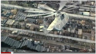
This birds eye view shot establishes the setting of the film. This shot shows the audience that the film took place in some form of large work place. This reveals to the audience that a lot of people were involved in the nuclear explosion and that there were numerous fatalities.


This is another over the shoulder establishing shot which takes place shortly after the first establishing shot. This shot reveals more to the audience the location of the film and a hint to the narrative.

Dialogue from one of the characters also drops a hint to the narrative of the film. The character says; 'this place was abandoned over night, they had no time to take anything.' This dialogue gets the audience asking questions like; 'why was it abandoned over night?' This also follows Barthe's Enigma theory as the audience want to find out more. 

Text is then displayed on the screen shortly after the establishing shots. The text reveals that the creator of this film, has also produced another big hit film. This suggests to the audience that Chernobyl Diaries will also be another big hit film and will want to watch it.


This shot shows a man at the bottom of the stairs behind the woman. This is dramatic irony as the woman doesn't know the man is there but the audience does. Dramatic irony is very effective as it gets the audience feeling tense as they are scared for the woman. It also gets them asking more questions like 'What's going to happen to the woman?' When creating my teaser trailer, I will try and include dramatic irony as it is a very effective of engaging an audience.

Throughout the whole teaser trailer, the colouring is very drained. This reveals that the film has a dark side to it and will attract an audience that are interested in dark scary films.